Tableau Dashboard 3
a project with a interactive dashboard to visualize Netflix content data
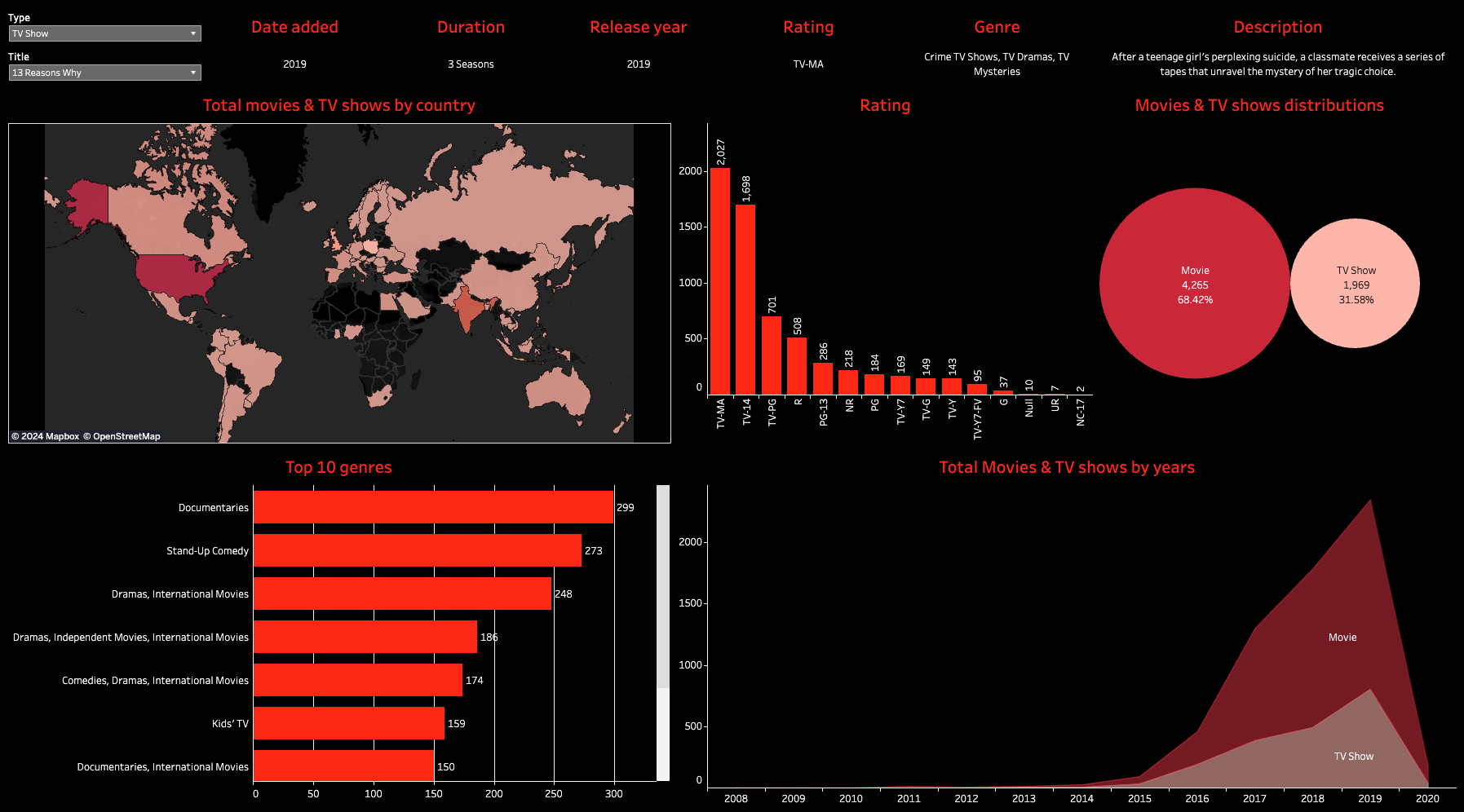
Of course, everybody loves watching movies and tv shows, and so as I! I wanted to visualize how Netflix has changed over the years. I have utilized the data from Kaggle to create a dashboard to visualize the Netflix content data. The dashboard is created by Tableau. The dashboard is interactive and you can filter the data by different attributes. The dashboard is also published on Tableau Public. You can see the dashboard by clicking the link below.
See more about the Netflix Overall Trend

The dashboard is very interactive. You can filter the data by different attributes. The data is stored in a csv file. The data is collected from Kaggle Netflix Movies and TV Shows.